

Color Psychology 2025: Best Colors for Calm, Energy & Mood in Every Room
- bhuntington2
- Dec 16, 2025
- 3 min read
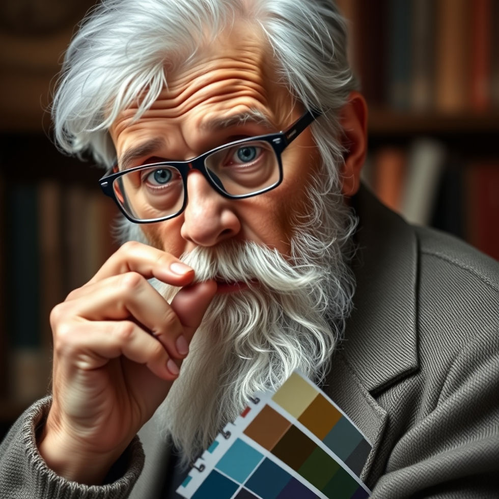
Color psychology is the study of how hues influence human emotions, behavior, and even physiological responses. From the calming effect of soft blues to the appetite-stimulating power of red, the colors we surround ourselves with can subtly (or dramatically) shift our mood. Understanding these effects allows you to intentionally design spaces that relax, energize, focus, or inspire. Reference How Color Psychology Affects Moods, Feelings, and Behaviors for more information on color psychology.
How Colors Affect Emotions and Mood
Scientific research and decades of observational studies reveal consistent emotional associations with color:
Blue lowers heart rate and blood pressure, creating feelings of calm and serenity. It’s linked to productivity because it reduces stress hormones.
Green, the most restful color for the human eye, symbolizes nature and renewal. It relieves stress and promotes balance.
Yellow stimulates mental activity and optimism but can cause frustration or anxiety in large doses due to its high visual stimulation.
Red raises energy levels, heart rate, and respiration. It evokes passion and excitement but can also trigger aggression or hunger.
Purple combines blue’s stability with red’s energy, fostering creativity, luxury, and introspection.
Orange is sociable and enthusiastic—a blend of red’s passion and yellow’s cheer. It encourages interaction and appetite.
Pink softens red’s intensity, conveying compassion and nurturing. Baker-Miller pink has been shown to temporarily reduce aggressive behavior.
Neutral tones (gray, beige, white) provide emotional breathing room. Warm neutrals feel cozy; cool ones feel clean and spacious.
Black and dark shades add sophistication and power but can feel heavy or depressing if overused.
These responses have cultural variations: white symbolizes purity in Western cultures but mourning in many Asian cultures. However, physiological reactions remain remarkably consistent across populations.
Choosing Colors for Relaxing Rooms
To create a tranquil retreat, prioritize colors that lower arousal and promote restoration:
Bedrooms & Meditation Spaces
Soft blues (powder, sky, or slate blue)
Sage and moss greens
Lavender and muted lilac purples
Warm grays with blue undertonesTip: Pair with natural textures (linen, wood, wool) to enhance the grounding effect.
Bathrooms & Spas
Seafoam green + crisp white
Pale aqua or turquoise (evokes water)
Sandy beiges for a beach-like escapeAvoid bright reds and oranges—they stimulate rather than soothe.
Living Areas for Unwinding
Earthy greens and muted terracotta
Creamy off-whites with warm undertones
Dusty rose or blush pink accents
Pro trick: Use the 60-30-10 rule: 60% dominant calming color (walls), 30% secondary (furniture), 10% accent (pillows, art), to maintain balance.
Choosing Colors for Energizing Rooms
When you need motivation, creativity, or social connection, select hues that raise energy:
Home Offices & Creative Studios
Sunny yellow accents against neutral walls (stimulates intellect without overwhelming)
Coral or peach oranges (encourage confidence)
Teal (blue + green) for focused creativityResearch from the University of Texas found orange significantly increased perceived energy levels.
Kitchens & Dining Areas
Warm reds, oranges, and yellows stimulate appetite
Bright apple green for fresh, lively mornings
Terracotta or mustard for cozy dinner parties
Workout Spaces & Entryways
Bold reds and bright oranges boost adrenaline
Vibrant lime green for motivation
High-contrast black + white + one vivid accent color creates dynamic energy
Practical Tips for Implementing Color Psychology
Start small - paint one accent wall or introduce color through removable wallpaper, rugs, or artwork.
Consider natural light - north-facing rooms feel cooler (favor warm hues); south-facing rooms can handle cooler palettes.
Test large swatches - colors shift dramatically under different lighting conditions.
Layer shades of the same hue - (monochromatic scheme) for sophistication while maintaining the desired mood.
Balance with neutrals - prevents overstimulation and lets the emotional color shine.
The Bottom Line
Your home should support how you want to feel, not fight against it. A bedroom drenched in stimulating red may explain restless nights; a home office painted institutional beige could sap motivation. By understanding color psychology and intentionally selecting hues, you transform rooms from mere spaces into environments that actively enhance emotional well-being.
Whether you’re craving serenity after a stressful day (reach for blues and greens) or need a creativity boost (embrace yellows and oranges), the right palette is one of the most powerful… and affordable tools in home design.
For more information on color psychology here is some follow up reading, and if you need any help with color selection, or applying them, Liberty Painting Specialists is just a phone call away. As always estimates are free… (479) 640-4675.


Comments